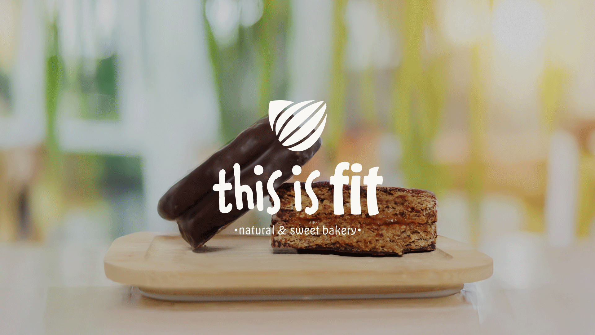
This is fit is a healthy bakery brand that combines wellbeing, flavor, and a positive attitude, represented through a warm, artisanal, and cohesive visual system.
Branding & Visual Identity • Packaging
ConceptArtisanal sweetness + conscious wellbeingInsightToday’s consumers seek balance - health without sacrifice. This translates into a brand identity that feels approachable, positive, and versatile.
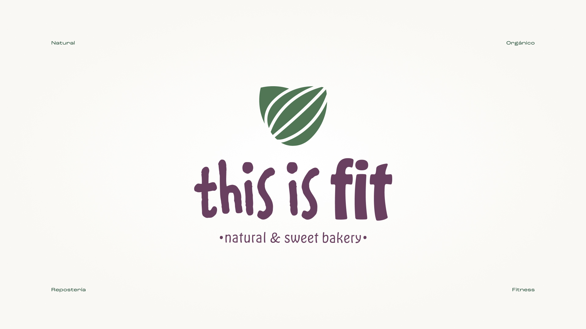
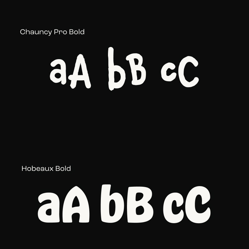
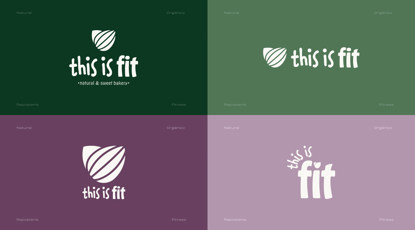
For the logo, two typefaces with contrasting yet complementary personalities were combined. Chauncy, with its imperfect and expressive strokes, brings the artisanal character of baking: handmade, authentic, and human. Hobeaux, in contrast, is a clear, elegant, and modern typeface that conveys lightness, balance, and the concept of fit in a subtle way. The combination of both reflects the essence of This Is Fit: artisanal sweetness and conscious wellbeing in balance.
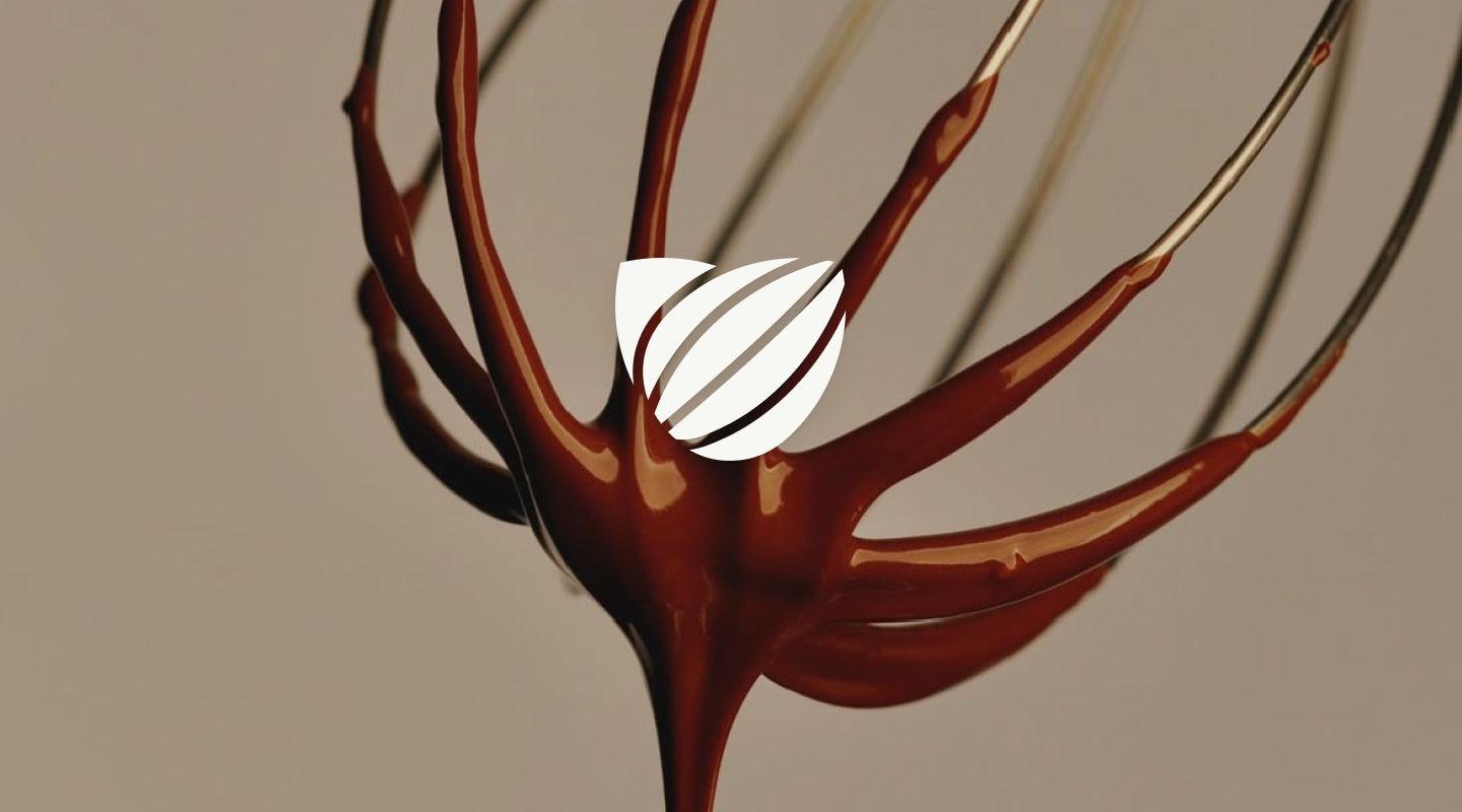
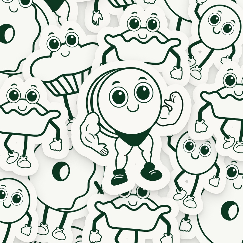
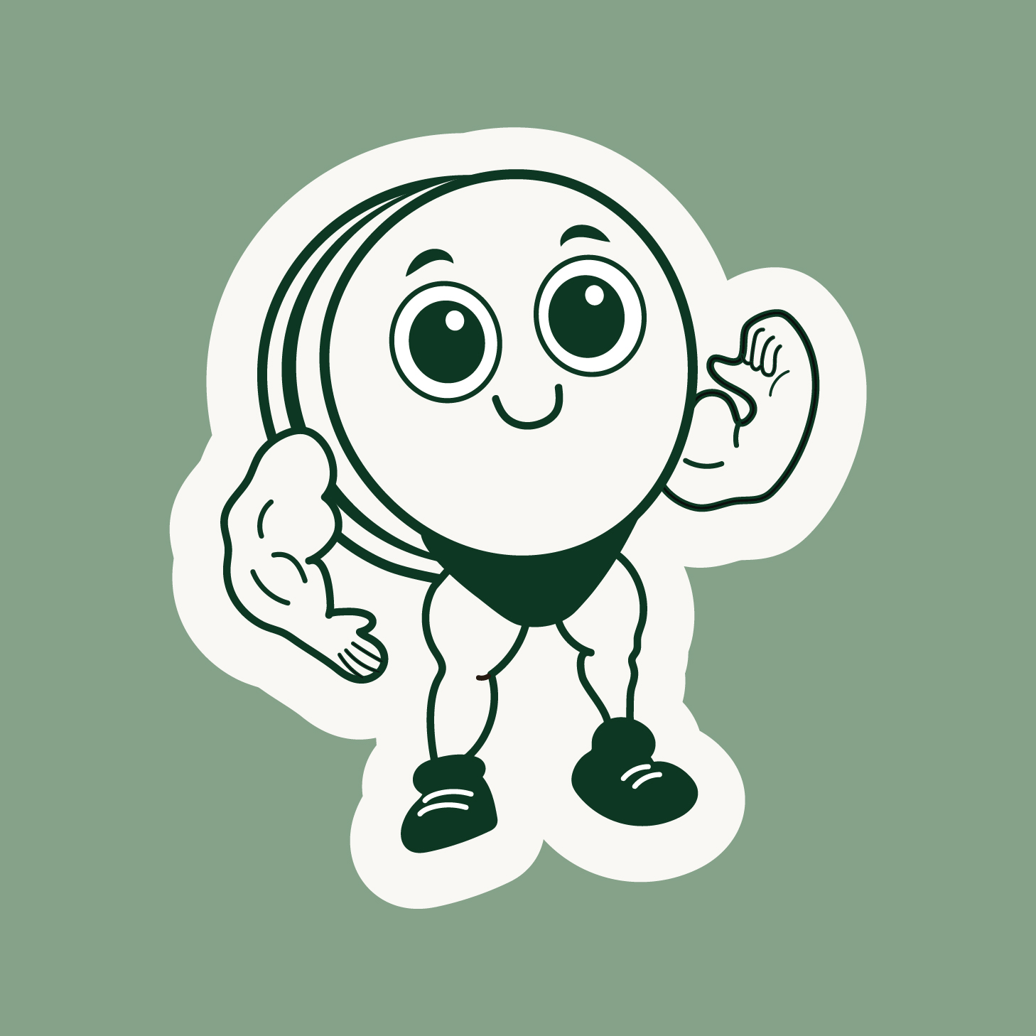
The main icon is built from abstract shapes with a conceptual foundation, designed to bring personality and an authentic visual language to the brand. The selected elements interact with one another to create a clean, simplified, dynamic, and functional icon, rich in meaning.
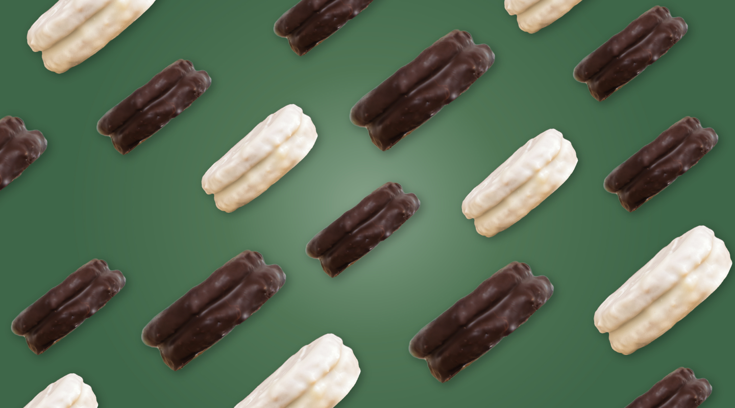
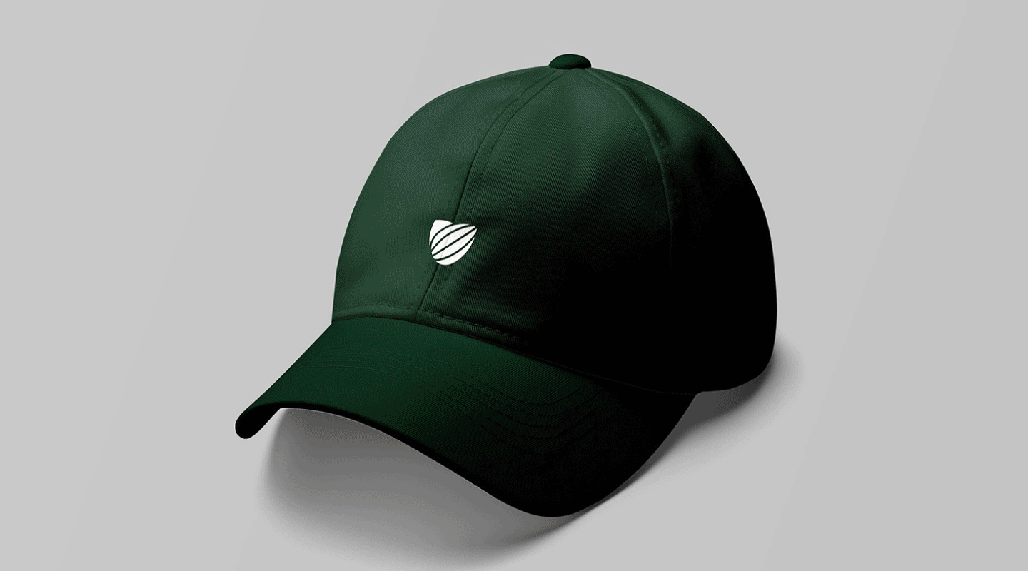
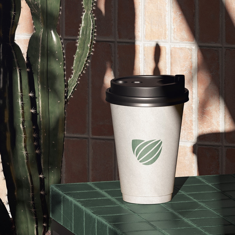
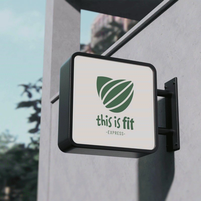
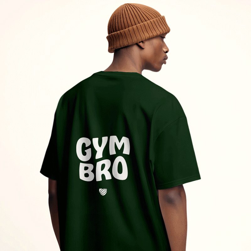
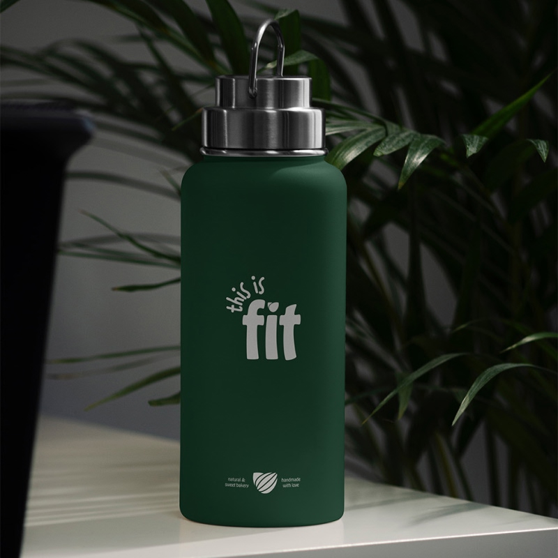
To ensure brand versatility, a primary logo and a set of logo variations were designed, allowing the identity to adapt across different applications such as labels, characters, packaging, and merchandising.
The design strategy for This is Fit focused on building a purpose-driven brand capable of clearly reflecting its essence and value proposition. From this foundation, a professional, versatile, and easily recognizable visual identity was developed, designed to function across multiple touchpoints — from bakery packaging to additional elements that expand the brand’s sales channels.

Copyright ©2024